
According to the research, 85% of consumers buy products based on colors. It means color speaks louder than words.
It’s not just a visual representation of your product but, it translates and communicates the product message as well. It creates an irresistible impulse that triggers human emotions to purchase the product instantly.
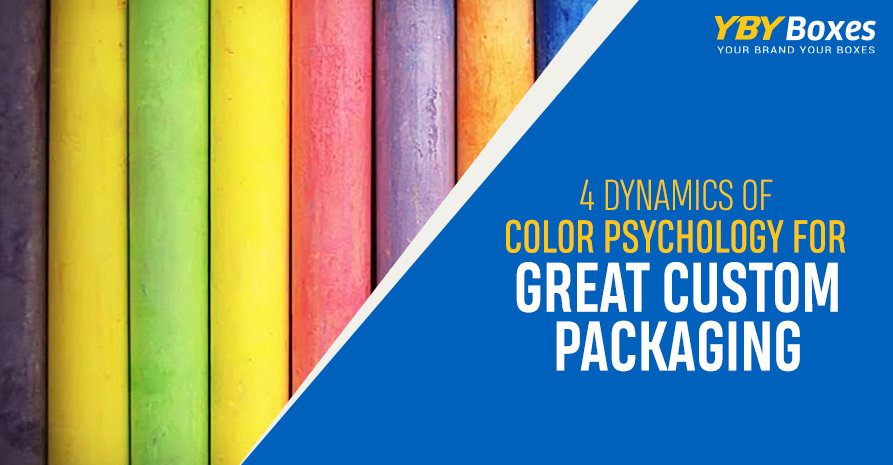
Hence, never underestimate the magical power of colors. They cast an invisible spell on when used in printing on custom packaging boxes. It speaks a language of its own and influences the customers in unimaginable ways.
To make your product visually attractive and eye-catching from a great distance keep a track of the color combination used in your packaging boxes.
Here are the following tips that can help you select the perfect colors combination while designing or customizing custom packaging boxes:
If you want to hit the ground running, keep in mind your target audience. Take into account their age, gender, culture, and education. Start to think and behave like a customer and, what motivates them to buy your product. Try to figure out your customers’ experiences, mindsets, and buying behaviors that would definitely aid in selecting the correct color scheme.
- Stay Unique:
Businesses and companies want to stand out from the competition and want to create a unique brand identity. Similarly, in the realm of the retail market, every business craves its products to be the talk of the town and, shining bright on the front shelves.
The secret ingredient of keeping your product appealing and captivating is choosing the right colors. To appeal to maximum potential customers, they can go for colors like red, yellow, and sky-blue that instantly grab the customer’s attention.
- Convey the Message:
The real essence and spirit of the product must stay alive. It needs not to be overshadowed or dominated by the color palette. No doubt, 93% of consumer’s decision is based on visual appearance. But, it should never undermine the message or the spirit of the product. It needs to be visually attractive and, at the same time spread its message out loud.
- Sustain the Brand’s identity:
Although experimenting with a color palette is quite delightful but, remember that old is gold. Nothing can beat the grace and beauty of the old school thought.
When it comes to custom printed packaging, consistency in color is the key to success. For decades, companies continue to use the same old color that helps in developing a special recognition and bond with the customers.
It helps in trust-building, rapport, and easy identification with the customers. Lack of color consistency is a stumbling block towards the brand identity.
Since the color scheme is not only an integral part of custom printed boxes but, also influences the customer decision making. Hence, this point can’t be overlooked by both the manufacturers and the customers. Create a difference in your life with a little pop of color!